Did you know that you are privileged by having an email address of your potential customer?
Why?
Because by subscribing to your newsletters, your potential customers allow you to reach them out directly. And this is much more awesome than catch them accidentally on social media or show your extremely expensive ads for gods know who on the web.
Moreover, among all marketing means, the email marketing is a star by generating real sales:
- Every bulk email sent brings you $0.36 (in the US).
- $446 is the average revenue per campaign (in the US).
- The ROI of emails is $44 for every single dollar that you spend.
That’s why you have to build a strong and faultless email marketing strategy to approach your customers and don’t let them down with your messages.
The following hints will guide you through the email marketing building process.
Hint 1. Use attractive forms to collect email addresses effectively
For the fruitful email marketing, you need engaged email subscribers. Where should you find them?
Engaged subscribers will be the ones that have visited your site at least once, they know your products, follow you on social media, they subscribe to your newsletter, they talk about your brand, etc.
This kind of subscribers is a real fortune for all types of business. And you can have them by intriguing them once they land on your site.
Alongside beautiful website design, use interactive signup forms that will make a dialog with your visitors. They will become your subscribers and will let you approach them over and over again with your emails.
Let’s see these highly effective signup forms.
#1 Wheel of Fortune
Invite your site visitors to play. They will love it!
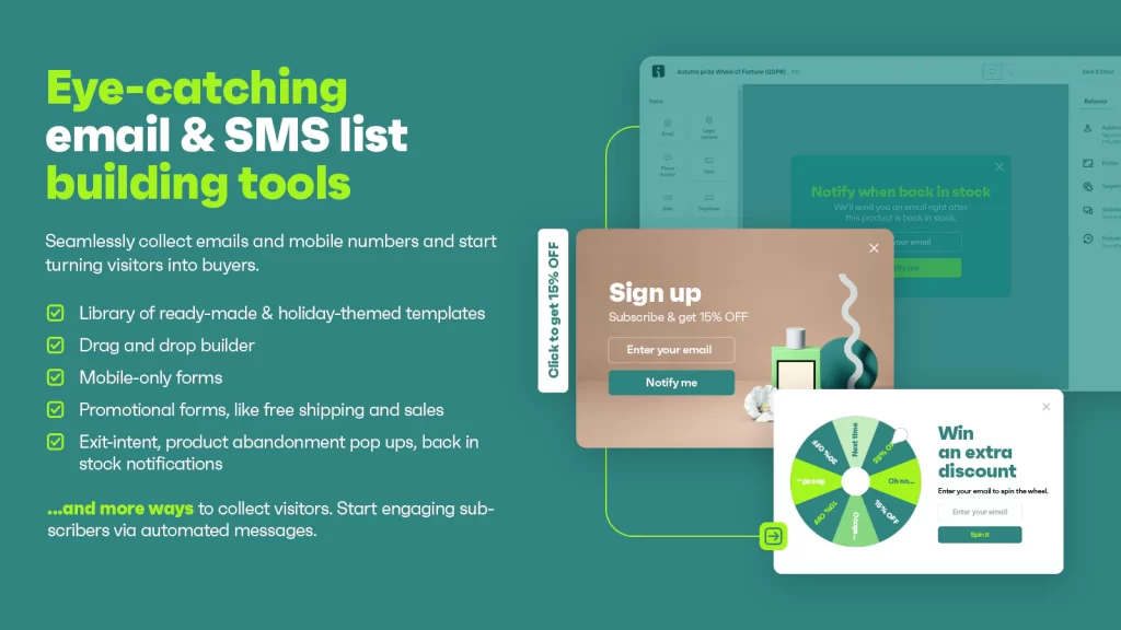
Try signup forms like Wheelio by IT Trading, Spin a Sale or Wheel of Fortune offered by Omnisend. These forms are interactive, they ask you to enter your email for the opportunity to spin a wheel and win a prize on your site.
The prize can be a discount for the first purchase, free shipping, or giveaway – you decide on that by setting the form up.
Why it’s so effective?
It’s fun, it’s engaging and groundbreaking. You get 3x more signups and extra purchases from the first time visitors. Awesome!
#2 Exit-intent popups
As you already know, the most effective signup forms are those that offer something in return for the email address. It can be a free shipping, a small discount for the first purchase, a downloadable style book, etc.
However, some signup forms perform better than other ones.
At Omnisend, we’ve learned that the popups that appear on the exit perform better than any passive signup form at the bottom/top of the page or even the same popup that appears immediately the visitor lands on the page. The circumstances matter.
So you can try this kind of popup with the different offering and copywriting.
For inspiration, see the examples below.
Example #1.
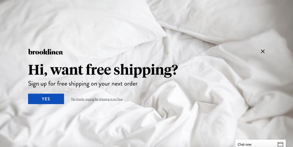
Example #2.
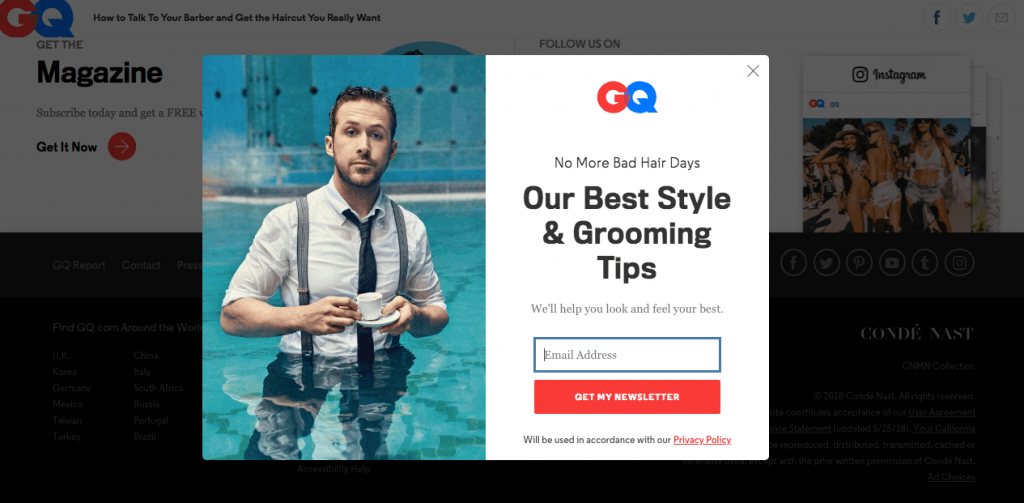
Example #3.
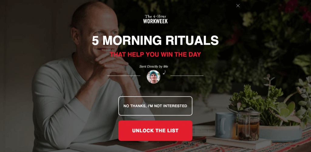
As you can see from the examples, your popup can be funny, promising or even it can flirt with the customer. It’s up to you.
And remember, the sooner you start collecting email addresses, the earlier you send your first email campaign and generate sales.
Hint 2. Use marketing automation to be always relevant
In the email marketing, one of the biggest parts of pie belongs to automated email workflows. These workflows are responsible for bringing the right message to your customers at the right time. So your brand communication looks sharp and straight to the point.
Even if you are email marketing beginner, automated email setup isn’t complicated.
MailChimp is the leading email marketing platform. If you are searching alternatives to MailChimp for ecommerce, Omnisend can be an option.
Furthermore, these emails don’t require the usual care that the bulk email campaign does. You set up them once and leave them to do their work until you have new ideas for improvements.
Now let’s take a closer look at the highly effective Welcome and Abandoned cart emails.
#1 Welcome emails
When your site visitors sign up for a newsletter, they trigger the automated welcome workflow. That means, your email service provider automatically sends to your new subscribers an email to welcome them onboard.
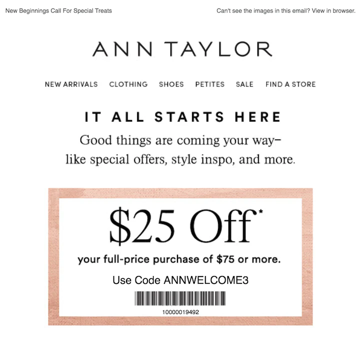
You may choose one email or a series of three to five welcome emails to send. At Omnisend, we see that three emails are the most effective for welcoming your new subscriber and introducing your brand. A series of three emails can bring you three times higher open and click rates — as well as five times higher revenue.
What should you say in your emails?
- Introduce your brand and your different collections,
- Show something “behind the scene”,
- Invite to follow you on social media,
- Add happy customer reviews,
- Add a small discount for the first purchase as an incentive to buy, etc.
See the example of welcome email series below.
#2 Abandoned cart emails
Did you know that only 25% of retailers send abandoned cart email to their customers? That’s a fun fact, knowing that it generates a 1.8% conversion rate and it’s 20 times better than a single newsletter.
So this approach to your customers can become your advantage in front of your rivals.
Cart abandonment emails are messages sent automatically whenever a visitor comes to your store and adds an item to their cart, but doesn’t buy the item.
It will take a mere 10 minutes to set up this email. Your email service provider will do the rest for you.
See the example of cart recovery email.
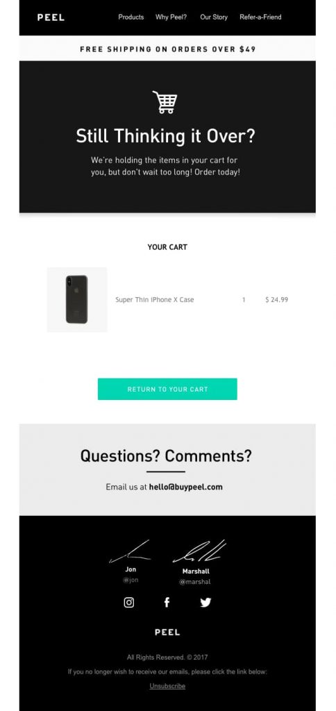
As you can see in this example, abandoned cart email is very simple and straightforward. It should have:
- A catchy subject line;
- Image of the actual abandoned product(s)
- A clear call-to-action button that links directly to the checkout page.
What is more, try sending a series of three abandoned cart emails. They perform even better than one (to be precise – 131% more orders than a single email).
The welcome and cart recovery emails are a good place to start. However, don’t limit yourself. Try even more workflows that will help you be relevant and appear in your customer’s inbox right on time.
Hint 3. Send a masterpiece email campaign
Working with email marketing day by day for about four years now, I’ve seen many good and bad promotional email examples. In most of the cases, an email design is a culprit.
Beautifully designed, clean and not overwhelmed emails always get more attention, people tend to read them more and engage with them more.
“People find different things beautiful” – you may say. And you are right.
However, these are my few tips for email design that can come in handy:
- First of all, your business logo should be of high quality and with a transparent background. If you want to look professional, your logo should always look perfect.
- Don’t use asymmetric, fancy email templates. In most of the cases, they are not mobile-friendly and look nice only for desktop users. Instead, pick something simple and clean that all subscribers could enjoy your content.
- For email template, choose colors of your brand or neutral white. Your email belongs to your brand communication and it should look like it really does. Subscribers will recognize you easier.
- Don’t mix a lot of different blocks of content. Focus on one, two or free things in one email and clearly define sections by using spacing and lines. Subscribers will get lost if you write an endless email with a lot of information.
- Don’t mix a lot of different types, colors, and sizes of fonts.
- Use only high-quality images for your emails. When people buy online, their decision is based on product photo and description only, so don’t mess up.
- If you use product listing, use the same size and same style of images. They cannot be blurred, too dark, or of different sizes.
- Give your email elements some room. Do not place them too close to each other.
- If you do not have any great photos, consider creating images using nice typography.
- The last but not least, use big and clear call-to-action buttons. The button is better than the hyperlink on the words. People tend to click on it more.
—
After all, I would like you to have these ideas in your head:
- Email marketing brings you a real money, but you have to do it.
- By using the interactive signup forms you will build your email list faster.
- Marketing automation helps you be relevant with your messages. Nowadays it’s a must for your business.
- Don’t overdo with your email design. Keep it short, simple and with a big call-to-action button.
I hope that you have learned something new and useful for your business. With this knowledge as well as “learning by doing” attitude you will become a real email marketing expert.
Karolina Petraškienė is a blogger and email enthusiast at Omnisend, the ecommerce marketing automation platform dedicated to helping ecommerce stores build strong, lasting relationships with their customers.


