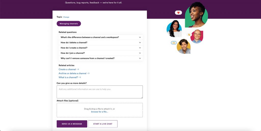
UX design is all about enhancing a user’s satisfaction and by making, in this case, a businesses’ website as accessible and easy to use as possible. Users are the pinnacle of any website and making sure your layout and user journey is as streamlined as possible, will help to increase the chances of conversion tenfold.
Contact forms are the perfect way to safely and securely allow your users to get in touch with you. Enquiry forms can help you generate more leads for your business, but a poor form can drive business away and into the arms of your competitors. If you struggle to find the exact UX issues with your forms, it might be time to call in a UX design agency, like the London based UX design agency, USIO. To give you a head start, here’s a few tips on simple changes you can make in order to improve user experience.
-
Keep Your Fields Minimal
Adding too many fields into your form could increase the amount of time it takes to fill out. Forms that take up a large chunk of time will usually have a higher drop off rate, as people like to spend as little time filling out information as possible.
Think about the vital information you need from your users. Usually, you’ll find that a name and email address is all you need. However, if your form is used for multiple purposes e.g. PR and media enquiries or customer questions, then you may need to include a message box.
-
Provide Instructions
 When providing any form, it’s always a good idea to provide instructions for your users. Even the simplest of forms can be confusing to some, instructions just ensure your users know what information to put in and also helps you get the information you need.
-
What Happens with The Data?
When asking visitors to your site for their personal information, such as name and email address, include a short blurb on how their information will be used. Some forms will be created purely for lead generation purposes, but some maybe for a newsletter sign up or notification sign up.
Making sure your users have all the information on where their data is going and how you will be using it, allows them to feel more comfortable with giving that information away. The more secure they feel, the more likely they are to complete the form.
-
Add a Clear Call to Action on The Homepage
If you look at your analytics and find that not many of your users are making it to your booking form, take a look at your navigation and CTAs on your landing pages. If your forms are your sites conversions, take a look at your homepage and see if it is clear where to contact you. A good idea is to include a ‘Book Now’ or ‘Contact Us’ button on the homepage that takes you to a contact page. When you’re thinking of your site from the user’s perspective, go through the steps as they would. As soon as you land on your homepage, is the form clearly labelled? Is it easy to find?
Your on-site forms are the easiest place to start when looking to boost your conversions. Hidden or poorly designed forms can have a huge impact on lead generation and with a few simple tweaks, you could find that the UX design of your form is easily rectified.


